The sneaker community is growing bigger and bigger, with that growth comes new demands and higher expectations on how people interact with their sneakers. Whether it be getting a new pair of sneakers or reselling them for profit we have seen an expansion in the digital space for almost every need of a sneakerhead (a term used for those who collect sneakers). Yet when we look at trading sneakers there is no proper structure that exists for such a high commodity.
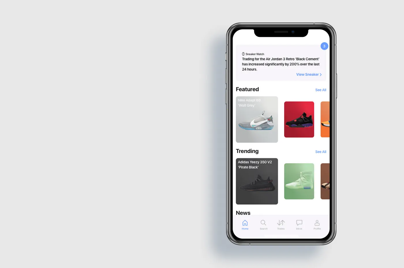
With companies like Nike & Adidas ramping up their production and creating more sneakers that are not just influenced by sports but pop-culture as well, we have seen a substantial increase in demands for their products. Collectors are constantly adding to their collection but at the same time they’re also moving their sneakers around to other collectors. This is where NuBox comes in to provide a much needed upgrade in the digital space by creating a transparent sneaker platform that the community can go to no matter what their trading needs are. A platform that won’t only facilitate trades for the users but also guide them on how to conduct their own transactions on a more secure level.
My Role
Including my mentor Mark, there were only two product designers for NuBox. In this case, I was able to dictate every aspect of the project and form it to the current state it lives in today. Under the mentorship of Mark, I was able to learn the product lifecycle and receive guidance from a UX industry expert on how to get the neccessary information to move forward through each phase. This includes the following…• Observing users’ behaviors
• Conducting proper user research
• Ideating
• Creating wireframes
• Understanding UI requirements for respective native applications
• Prototyping
• Usability testing
The Challenge
n order to define the problem at hand I went ahead and interviewed 7 individuals within the sneaker community. These individuals were selected based on prior experience or desire for trading sneakers. What I discovered during my interviews were a few commonalities which later transitioned into my core problems.
• Create a platform users can trust and feel safe using
• Prioritize a way to tackle fake sneakers in the market
• Minimize the amount of work needed to make a transaction happen
After defining the core problems I had to implement some research and figure out how I was going to prioritize each problem. According to a 2016 U.S. study, the fake industry market is worth around $461 billion with Nike being one of the most counterfeited brands. This was a major concern amongst the users I interviewed with, because even with existing platforms that are providing authentication services fakes are still finding a way into users hands with no means of slowing down. In order to tackle this problem differently and efficiently I knew that NuBox had to bring something unique to the playing field and introduce a more transparent way to communicate with its users in order to gain their upmost trust.
Ideation
Using a heuristic evaluation approach, I explored apps like StockX and GOAT which provides a reselling service for sneakerheads. What I found was that while GOAT had a minimalistic UI design that was appealing to use, it didn’t really provide much information about how the transactions were handled for users or what a users expectations should be when creating a listing. Whereas StockX was messy and cluttered with irrelevant sneaker information for a user to navigate through they were at the very least informative of what was to come ahead.
After doing some more research I knew that I had to build a level of comfort into NuBox. Being centered around the idea of openness and transparency the goal was to have users feel informed at all times. Whether this be through creating a trade request or fulfilling a pre-existing trade, users should not only know how to navigate to these areas but what to expect after completing their desired tasks.
First Impressions
With the screens finally sketched the next step was to put them through their first test. Would users grasp and understand how to navigate the information provided to them? Would they be excited about the possibilities of this concept? Is it as user-friendly as possible? The answer was no.
What I discovered instead was that while I had a product that was exciting at hand and met with a lot of positive reaction it was lacking its humanistic touch. The verbiage was a main issue that needed to be addressed. NuBox needed to feel like a companion guiding you through the process instead of having users feel cumbersome going through each step. This called for another revision before converting the sketches into wireframes.
Digging Deeper
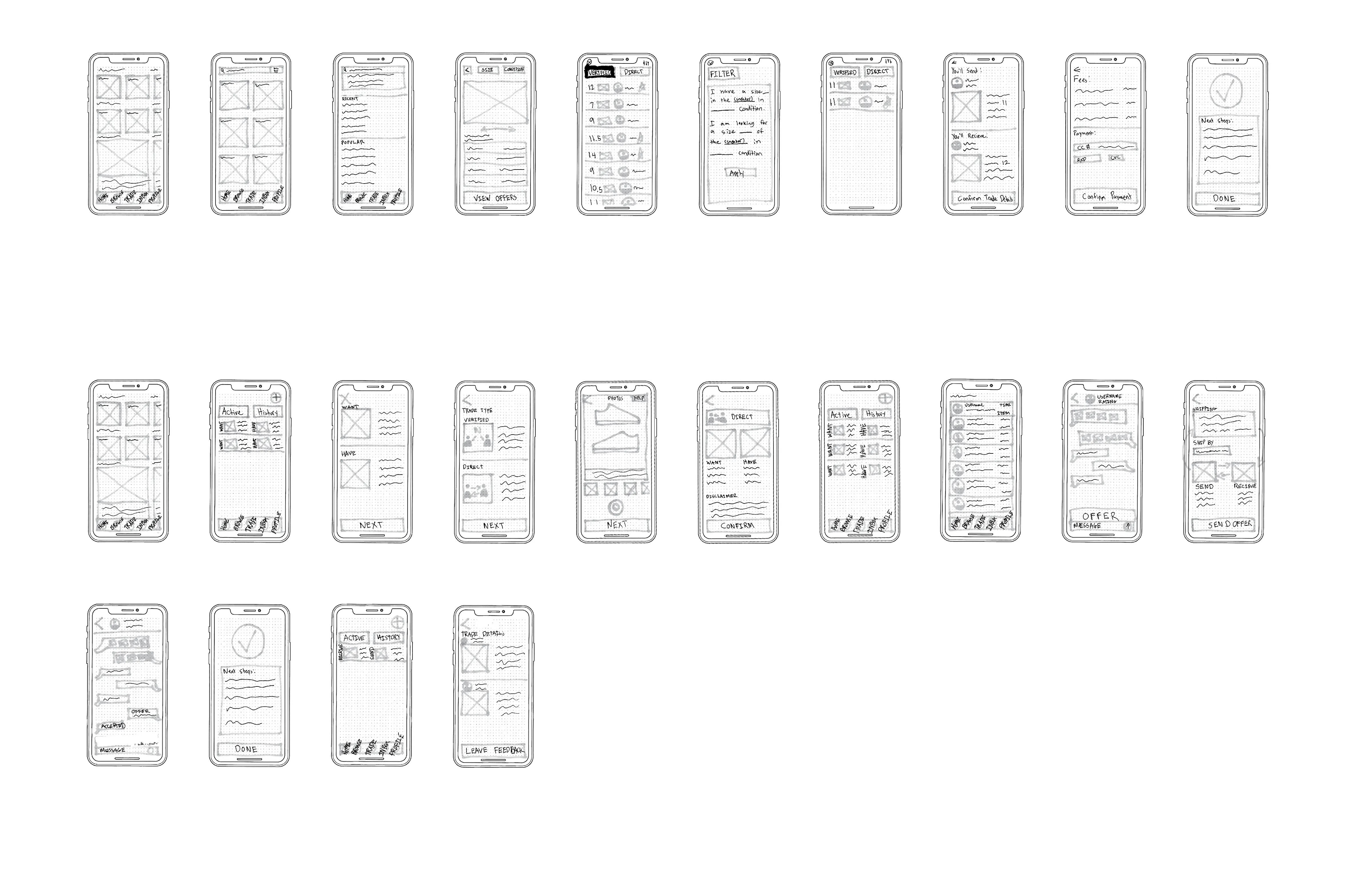
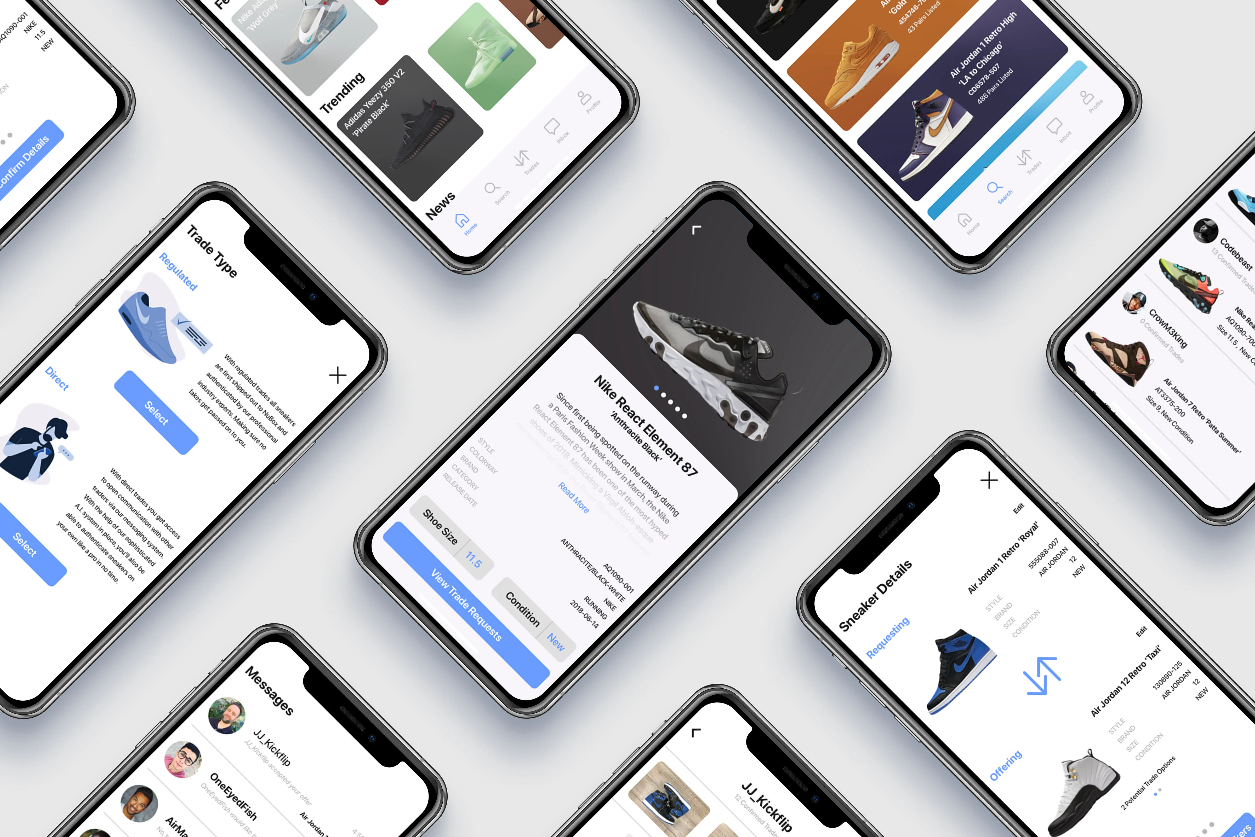
Upon completing wireframes for the two most popular red routes that users would take (creating a trade request and completing an existing trade) while using NuBox it was time to put it through another test. With low-fidelity screens as shown above, users had a better understanding of what they were looking at compared to the sketches shown earlier. The main issue to tackle was the verbiage which ultimately ended up being a success with minor room for improvement.All wasn’t good however. Now that users had a more clearer understanding of the screens other issues that didn’t seem to arise in the first test now existed here. A lot of information seemed to be placed awkwardly such as the shipping address information on the trade details screen. This confused users as to whose address was supposed to be shown, the shipper or the receiver? These are problems that are better addressed now rather than the actual high-fidelity design phase as it’s easier to move information around and design accordingly.
Design
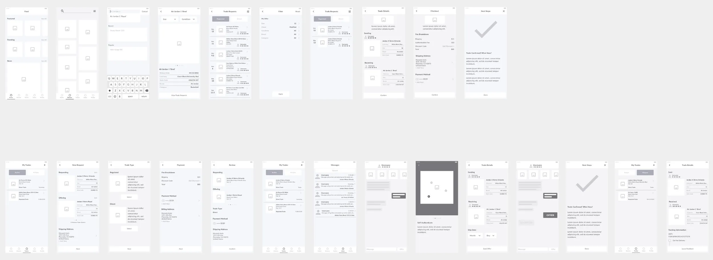
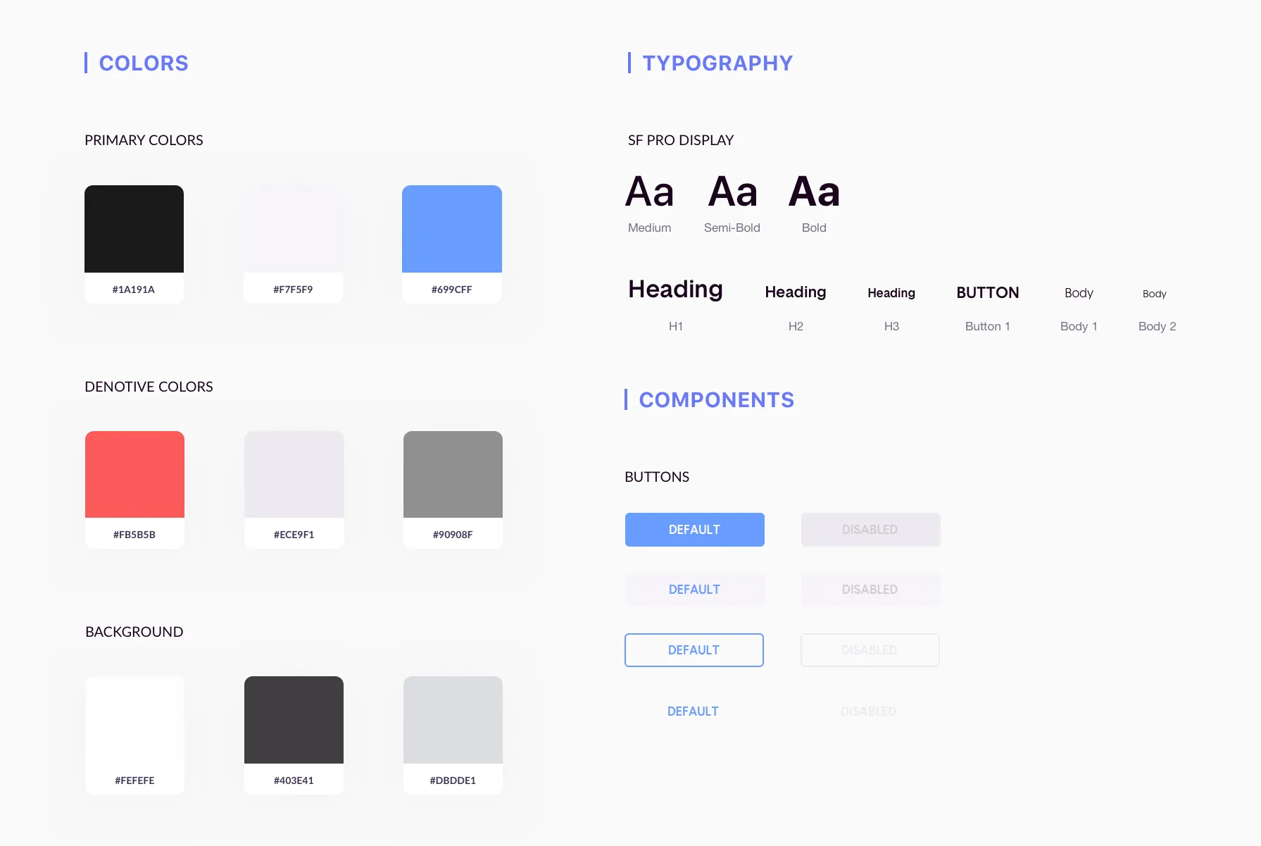
With NuBox being an iOS native application it was important to cater the design elements to Apple’s human interface guidelines. Noting the changes that needed to be made from the previous wireframe testing, the high-fidelity screens were constructed following a more strict set of rules and adhered based on a proper grid structure and design decisions. A style guide was aso created and always at hand as a reference in order to maintain consistency and build up a theme.
Prototyping & Usability Testing
Now that the screens were completed it was time to build a functioning prototype to go through another round of testing. All screens were uploaded and prototyped via InVision (which you can access at the end of this case study). The prototype ultimately went through two rounds of usability testing with 5 users in each respective test. The results were as followed:
Usability Test (Round 1)
• Search tab organization had users feeling confused
• Offering system through messages felt more like a chat rather than a transaction
• Timeframe for payment is not made clear for new requests
Usability Test (Round 2)
• Users predominantly used search tab to navigate all requests
• Wanted less requirements for self-authentication method
• Raised concerns about editing offers already sent if changes needed to be made
Future Thinking
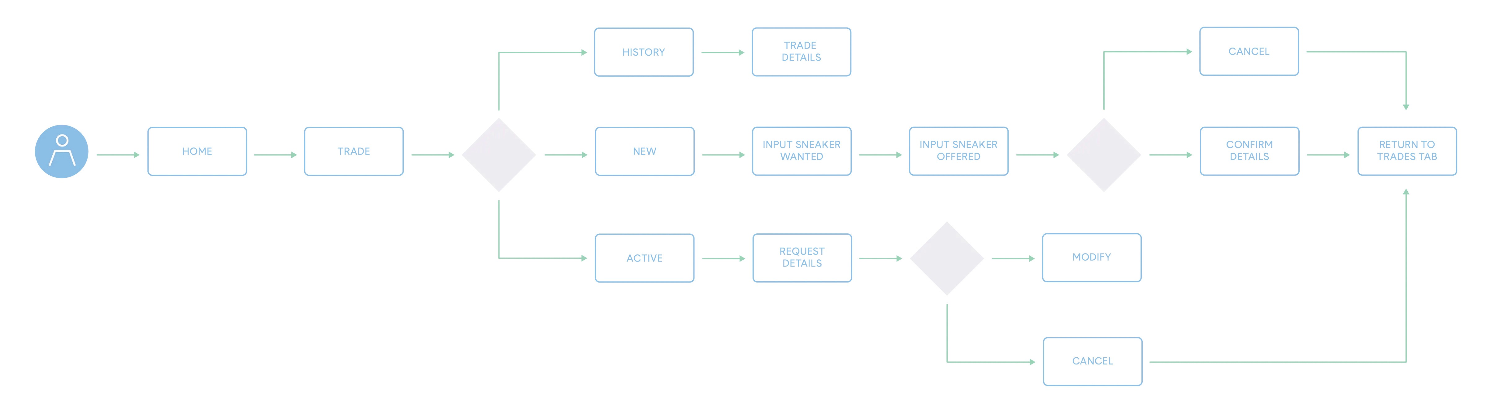
Moving forward the next iteration of the app would be redesigned so that a majority of the tasks can be managed through the actual product screen. Seeing as how most users looked through the search tab for the sneaker they were interested in to dictate their next action, it only seems logical that most of the user actions be availably managed at the product screen directly instead of the current trades tab set-up. Using the trades tab as a means to view and manage active requests and past trades only. This creates a more streamlined flow for users to get to their desired actions in more of a central hub instead of navigating through multiple locations.
What I've Learned
1. The importance of designing and testing a prototype is crucial to the success of any given product. Measuring metrics and seeing any signs of improvement is the only way to know you’re headed in the right direction. Without this process it’s hard to analyze a feature’s impact on a product, which makes it hard to iterate a product in the later steps.
2. Managing and prioritizing both the users and business needs. In the case of this project, as the designer I had to hold myself accountable as the business. Knowing that time is a valuable constraint and seeing certain problems arise throughout multiple testing phases I knew that I couldn’t answer every issue at hand. It was important for me to narrow down and tackle what was mutually valuable to both the user and the business needs.
3. Making every decision purposeful. After extensive research, testing, designing and prototyping I know that every decision made had to answer a simple question… why? Each decision directly effects every user that interacts with the product whether it be through behavior, digital footprint, and the way they perceive the overall product in general. It’s important that there be a purposeful reason as to why certain UI elements or interactions exist for this very reason.