Challenge
Nike.net supports a diverse global network of retail partners, from small independent shops to large commercial retailers across North America, Europe, and Asia. The platform is a critical tool where partners place, track, and manage their Nike inventory. Within Nike.net are multiple applications tailored to different stages of the partner journey. My focus was on improving the Order Manage section—the area supporting post-order activities such as tracking shipments, filing claims and returns, and resolving fulfillment issues. This part of the experience had become increasingly complex over time, with cluttered interfaces and workflows that caused friction for users trying to complete relatively simple tasks.
Research & Discovery
To understand pain points and identify opportunities, we conducted a series of user interviews, contextual inquiries, and workflow observations.
Key insights included:
Users found the interface overly dense, with too much information surfaced at once.
Simple tasks like searching for an order or filing a claim often required multiple unnecessary steps.
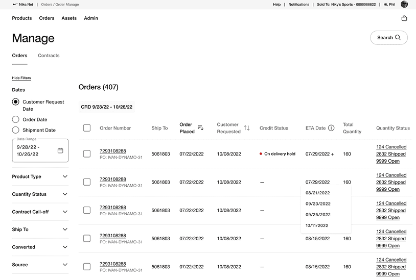
Users needed to handle multiple claims or returns at once, but the system supported only single-ticket actions.
Information on the order details page was not contextually prioritized, requiring users to hunt for relevant data.
Design Approach
Armed with these insights, we worked to redesign the platform with a clear goal: reduce friction and make core tasks feel effortless.
Key changes included:
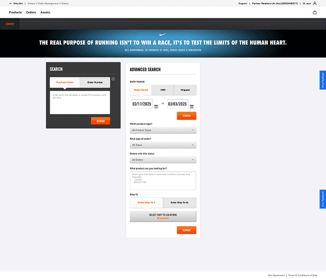
Search Integration: Made search a native part of the user workflow, eliminating the feeling of jumping between tasks.
Batch Claims & Returns: Introduced functionality that allowed users to file multiple claims in a single flow.
Information Architecture: Restructured the order details page with a drawer-based system to surface contextually relevant information without overwhelming the user.
Visual Simplification: Removed redundant elements and reduced visual noise to create space for focus and clarity.
Results
The redesigned experience significantly improved the usability and efficiency of the post-order workflow. Users were able to complete core tasks—such as tracking orders or filing claims—with fewer steps and less friction. The new batch functionality for claims and returns reduced the time spent on repetitive actions, allowing users to process multiple requests at once. Integrating search directly into the workflow eliminated unnecessary context switching, making it feel like a seamless part of the experience rather than a separate task. The updated order details page, with its organized drawer system, helped users quickly locate and act on the information most relevant to them in the moment. Overall, the redesign not only improved task efficiency but also boosted user confidence and satisfaction with the platform.