Challenge
Geopogo is a startup focused on creating experiences for architects and designers. They help turn renderings into 3D augmented reality objects in order to help designers visualize their projects in real word scenarios. Some use cases can be things such as seeing how a building will look like within a certain space of land, or how the inside furnishing might be done in a newly renovated room. This is the magic of AR and its wide array of possibilities.
My role in Geopogo was to help execute this vision. As a startup, they were at a place where things were starting to move rapidly for them. They needed someone to help redesign their current UI for the desktop software into a more user-friendly and easy to digest tool that would help their users rather than hinder them.
First Impressions
Normally when redesigning any piece of software it’s typically good practice to get some feedback and information from users who are already using it. However, due to the nature of this project with it being relatively new to the market as well as working within a tight deadline, I had to find a way to work as efficiently as possible.
Mike Hoppe (Geopogo’s Creative Director) was one of my main contacts throughout the project. Speaking to him about the company gave me an insight about their vision and direction the company wanted to head towards. From there I went on and took the time to familiarize myself with the current software. My initial impressions and things that stuck out to me were going to be my catalyst for opportunities I can either improve or build upon.
Inspriration
After sitting and analyzing the current UI for the rest of the day I knew I had to do some competitive research and see how other softwares were structured. Doing so would allow me to further exploit more potential problems with the current UI as well as see opportunities that can be migrated and brought on to further enhance the user experience.
A commonality amongst most of the softwares that were analyzed was a dedicated toolbar. This made sense as having a dedicated section to go to for your main tools would simplify things for users and help them get familiar with the program faster rather than having them jump all over the screen to perform related actions.
Sketches
With most of the research out of the way it was time to start brainstorming and sketching out concepts. During my first meeting with Geopogo, I was told they wanted to ‘gamify’ their UI to represent something that a company like PlayStation might create. Personally, I felt this was the wrong direction to head towards as our target audience weren’t gamers. The people we were designing for instead are familiar with programs such as Revit, Unity, and Rhino. With that in mind the UI should cater to these professionals and help make them feel at home and not frustrated when using the software.
Iconography
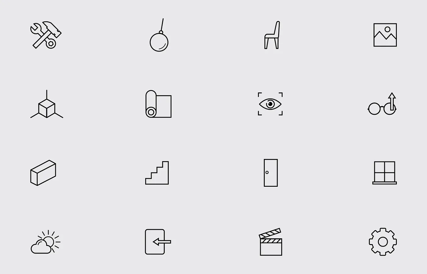
Ultimately the decision was to go with a layout that would focus on a single toolbar. This meant that the next task at hand would be to focus on the icons for that toolbar. A majority of the existing icons had to be reconstructed to better represent the tools associated with the software. These tools included functions such as build, demolish, materials, objects, background, view, etc.
Along with those tools were subtools associated with them which lead to even more icon creations. The main goal when creating the icons was to have enough of a differentiation between each tool to help users define them as well as a cohesiveness in terms of the visual style.
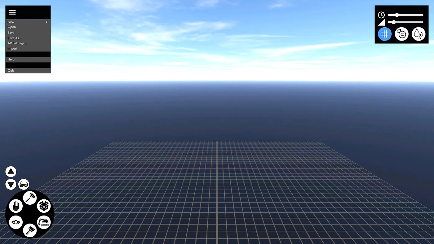
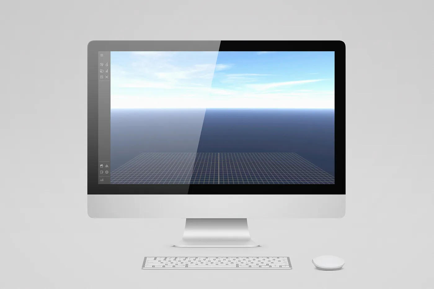
Remastered UI
After a month of reconstruction, the final UI is a more simplistic and efficient tool that will hopefully help future clients bring their projects to life. Away with the old messy layout and in with the new and sleek design to represent the future of Geopogo. If time allowed, my next steps would be to get some user testing done and generate feedback to even further improve the UI. Most of the hard work is over with the skeleton and structure already laid out. It’s just about improving on the small things and keeping an eye out for any potential areas of concern.
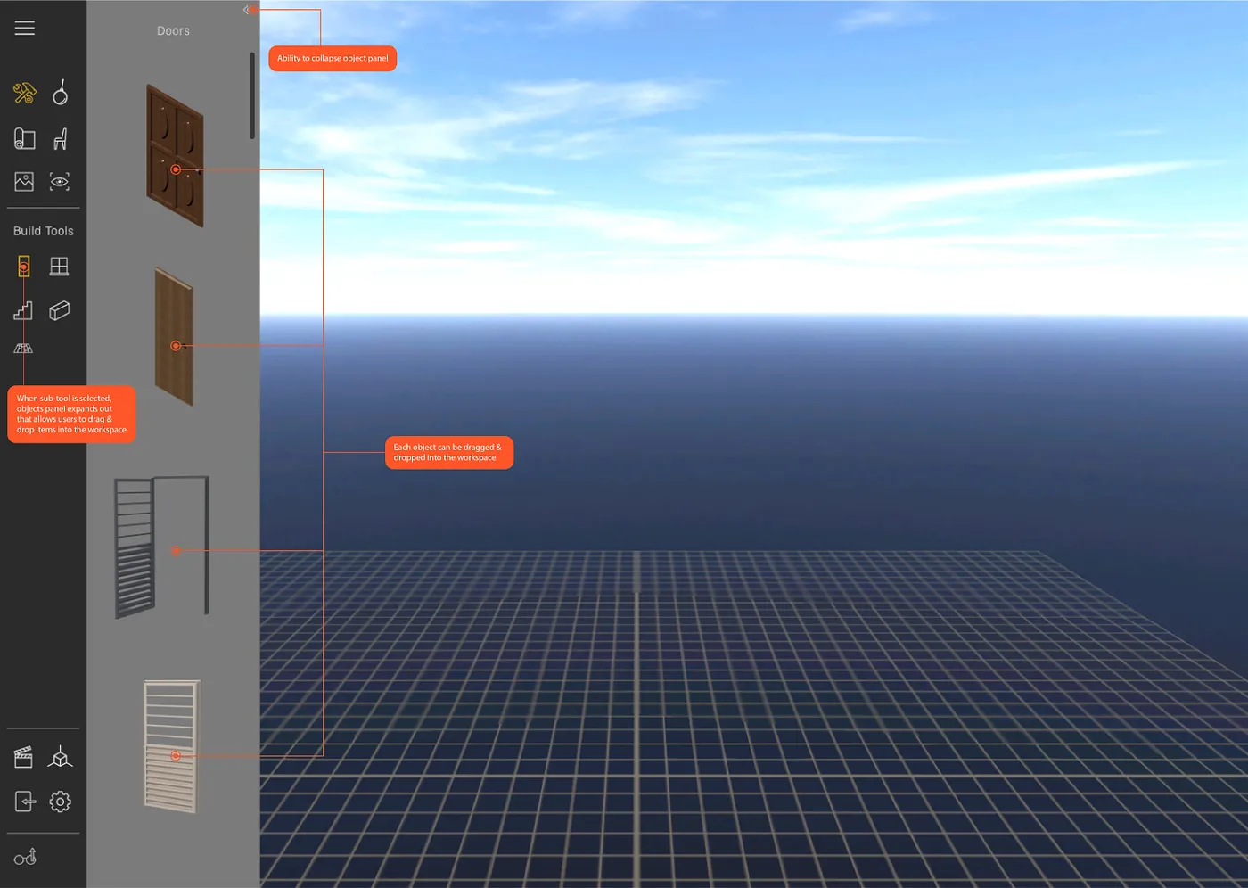
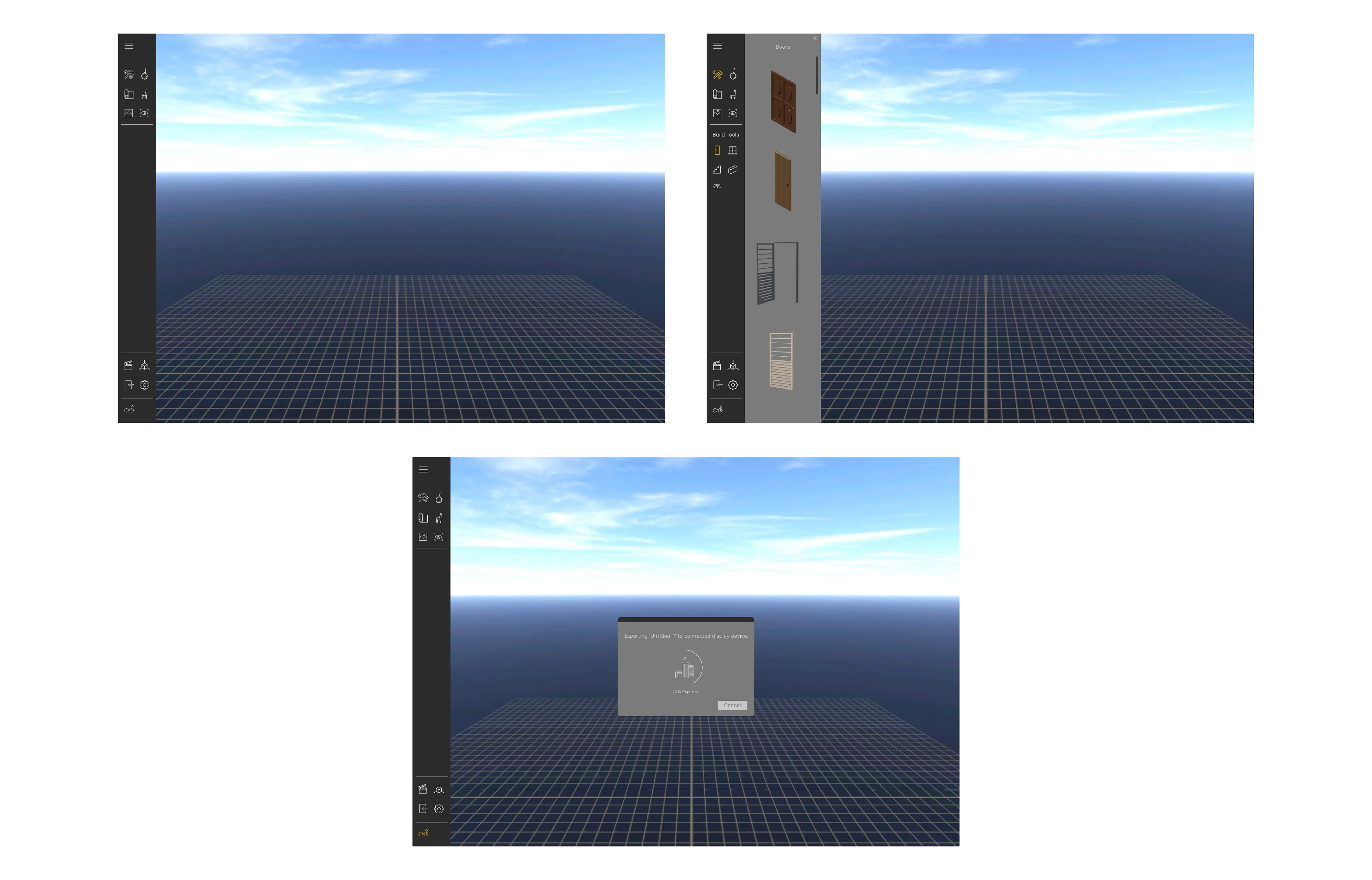
Developer Hand-Off
With the UI finalized it was time to hand off to the developers. Taking all the screens I created, I had to keep in mind every action a user might take throughout the use of the software. This included any user error issues (such as misclicking or failing to place an object). Every aspect of the design had to be well thought out and created so that no empty screens were left for the developer to figure out. Compiling them all into an easy to read guide with annotations so that anybody working on the project will know exactly how every aspect of the software is supposed to function.
What I Learned
Although I was brought on to work on this project for 4 weeks, I felt that I gained a lot of invaluable experiences from my environment alone. Seeing the working nature of a startup and getting a product ready for launch in an agile environment was an experience that typically can’t be taught. Below are a few takeaways I left with.
1. You will typically be working alongside many people in many different roles, it’s important to communicate efficitvely so nothing gets lost in translation.
2. You won’t always get to execute a project your way and it’s important to understand that while still providing and educating those around you.
3. Respect other peoples time and always be punctual. This includes respecting yourself and making sure you don’t waste any potential work hours.